"Eclipse" is a full redesign of Wix's highest-traffic and highest-revenue purchase flow.
When I initiated this project, the challenge was improving one of the company's most optimized revenue engines without disrupting performance. Despite the significant business risk, the initiative was prioritized as one of the product roadmap highlights of the year.
By combining cross-industry research, a complete visual rethink, and a carefully controlled A/B testing strategy, Eclipse transformed a mature funnel into a scalable foundation for future growth and optimization.
The impact: an estimated +$1.5M annual revenue uplift with no degradation across core KPIs - demonstrating that meaningful UX improvements can drive business impact, even in highly optimized systems.
Overview
Eclipse was a redesign of Wix's premium purchase flow - the company's highest-traffic and highest-revenue funnel.
More than a visual refresh, the project aimed to rethink the purchase experience and establish a scalable foundation for future experimentation, optimization, and growth.
The Challenge
When I initiated the project, the existing flow was already considered one of Wix's most optimized revenue engines. It consistently performed well, and any significant change carried substantial business risk. Despite that, I saw an opportunity to rethink the experience from the ground up - not only to modernize the user experience, but to create a more flexible platform that could support future product and business goals.
Research
I began with extensive competitive research across both direct and indirect competitors.
Beyond SaaS benchmarks, I analyzed high-performing purchase experiences from companies such as Apple, Tesla, and major airline booking platforms.
The goal was to challenge existing assumptions and identify patterns from industries that excel at guiding high-intent purchasing decisions.
These insights helped shape a new vision for what a premium purchase experience at Wix could become.
Design Approach
Rollout
To ensure a valid A/B test against the existing experience (Sunrise), we preserved core behavioral patterns, including the above-the-fold structure and major decision points.
This allowed us to isolate the impact of the redesign itself and measure performance without introducing confounding behavioral changes.
The launch followed a gradual rollout strategy:
Impact
The redesign successfully maintained performance across core funnel metrics while introducing a significantly updated user experience.
Results included:
Eclipse demonstrated that even a highly optimized revenue engine could be reimagined without sacrificing performance, while creating new opportunities for future growth.
Sale version:
Led a mobile-first initiative for Wix's premium purchase experience, taking end-to-end ownership from product strategy and competitive research to UX design, rollout planning, and implementation using Cursor.
By combining user insights and competitive analysis, I designed and implemented incremental experiments that validated each product hypothesis independently, established a scalable experimentation framework, and continuously evolved the experience based on real data.
Phase 0 - Redesign:
Product Strategy
I started by understanding how Wix users made purchasing decisions on mobile, combining product analytics, FullStory session recordings, and user behavior data to uncover friction points and optimization opportunities.
I complemented those insights with extensive competitive research across SaaS and consumer products, analyzing plan presentation, pricing communication, layouts, interaction patterns, and decision-making flows. The findings shaped the product strategy and informed every design decision.
Design Approach
The research led to several product hypotheses:
I first designed the full mobile-first vision. However, because this was Wix's highest-revenue funnel, I intentionally broke it into smaller, incremental experiments. This allowed us to validate each hypothesis independently, run fair A/B tests, and minimize business risk while continuously evolving the experience.
Implementation
To accelerate delivery, I used Cursor to build the first release myself, starting from a raw responsive implementation and refining the UI, interactions, and responsive behavior until the experience matched the final designs.
This significantly reduced the gap between design and development, enabled faster iteration, and allowed us to validate ideas much earlier in the process.
After the first phase was fully rolled out, I continued leading the evolution of the experience by designing and implementing each subsequent phase, gradually introducing new mobile-first improvements validated through incremental A/B testing.
The project established a scalable experimentation framework for continuously evolving one of Wix's highest-revenue mobile experiences.
From phase0 to phase 4:

As part of Wix's strategic partnership with Intuit, I led the UX design of an end-to-end experience that enabled Wix users to purchase and activate QuickBooks - one of the world's leading accounting platforms for small businesses - directly through Wix.
Following launch, I represented Wix in a joint product workshop in New York, where I collaborated with Intuit to redesign the technically complex activation experience based on real user insights and shape the next phase of the product roadmap.
The Challenge
This project extended far beyond designing a purchase flow. The challenge was to create a seamless experience across two independent platforms while hiding the complexity of multiple backend systems and activation processes. My goal was to make the journey feel intuitive, trustworthy, and consistent from purchase through activation.
Design Approach
The first phase focused on designing the pre-purchase and purchase experience, focusing on:
Rollout
The experience launched to US users as part of the Wix × Intuit partnership.
Following launch, we monitored product analytics, collected qualitative user feedback, conducted customer interviews, and held weekly cross-company working sessions.
Post-launch
While the purchase experience performed well, the post-purchase flow introduced significant friction.
Because activation relied on multiple technical states across both Wix and QuickBooks, it was often unclear whether additional action was required or whether the process was still progressing in the background.
The challenge shifted from enabling a successful purchase to creating clarity throughout the post-purchase journey.
Joint Workshop
To tackle these challenges, Wix and Intuit brought together a small cross-functional team for a focused product workshop in New York.
Representing Wix's design team, I led the UX work on rethinking the post-purchase experience. Together, we mapped pain points, aligned on a shared vision, and defined a new direction for the product.
The solution introduced a dedicated subscription management page that served as a single source of truth for users. It provided visibility into their subscription status and enabled ongoing subscription management - all within Wix.
Success page of P1 - manual instructions

Success page of P2 - direct CTA

Management page
Beyond the Workshop
The workshop marked the beginning of a long-term collaboration with Intuit. Together, we defined a shared roadmap that extended far beyond the initial launch.
Over the following iterations, I continued leading the UX for key initiatives, including the UK launch, subscription upgrades and downgrades, QuickBooks Payroll, and a redesigned purchase flow featuring new AI capabilities.
What began as a single integration evolved into an ongoing cross-company product initiative, giving me the opportunity to shape the experience over time, learn from real user behavior, and collaborate closely with cross-functional teams across both organizations.

Led the UX design of a foundational operational initiative that aligned the product with Wix's evolving operating model.
Working as part of a small leadership team spanning Product, Engineering, Data, Operations, and UX, we redesigned the platform to support future monitoring, routing, and rule-based automation across Customer Care operations.
The Challenge
Wix Customer Care supports millions of users across hundreds of products, languages, and support channels. At the time, customer requests were routed across more than 300 product groups, requiring a sophisticated operational model to balance expertise, availability, and business priorities.
As the organization evolved, operational teams had already adopted Staffing Groups as part of their day-to-day workflows, while the product continued to rely on an outdated structure. This growing disconnect made it increasingly difficult to scale the platform, build new operational tools, or maintain consistency across routing, scheduling, dashboards, and reporting. Team Leads, for example, manually assigned experts across dozens of groups throughout their training and specialization.
The long-term vision - well before today's AI-powered operational tooling - was to establish a foundation for intelligent, rule-based automation that could monitor traffic in real time and respond automatically to changing operational conditions.
The Product Model
Rather than starting with interfaces, we first redesigned the operational foundation behind the product.
As part of a small cross-functional leadership team, I worked alongside Product, Engineering, Data, and Operations to define a new operational model that accurately reflected how the organization actually worked. The process involved months of workshops, iteration, and close collaboration to balance technical constraints, business needs, and operational workflows.
Because the new model fundamentally changed how teams operated, this wasn't only a product initiative - it also required organizational adoption. Together with Operations leadership, we introduced new workflows while evolving the product to support them.
Once the foundation was established, I designed the end-to-end product experience - from Staffing Groups management to dashboards and operational workflows - creating a shared foundation that future monitoring, routing, and automation capabilities could build upon.
Outcome
The project established the operational foundation for a new generation of Customer Care tools by aligning the product architecture with the way the organization actually operated.
More than designing new interfaces, it reinforced the importance of understanding how organizations work, aligning stakeholders around a shared operational model, and building product foundations that can evolve alongside the business.

Wixel is Wix's AI-powered design platform for creating and editing visual content.
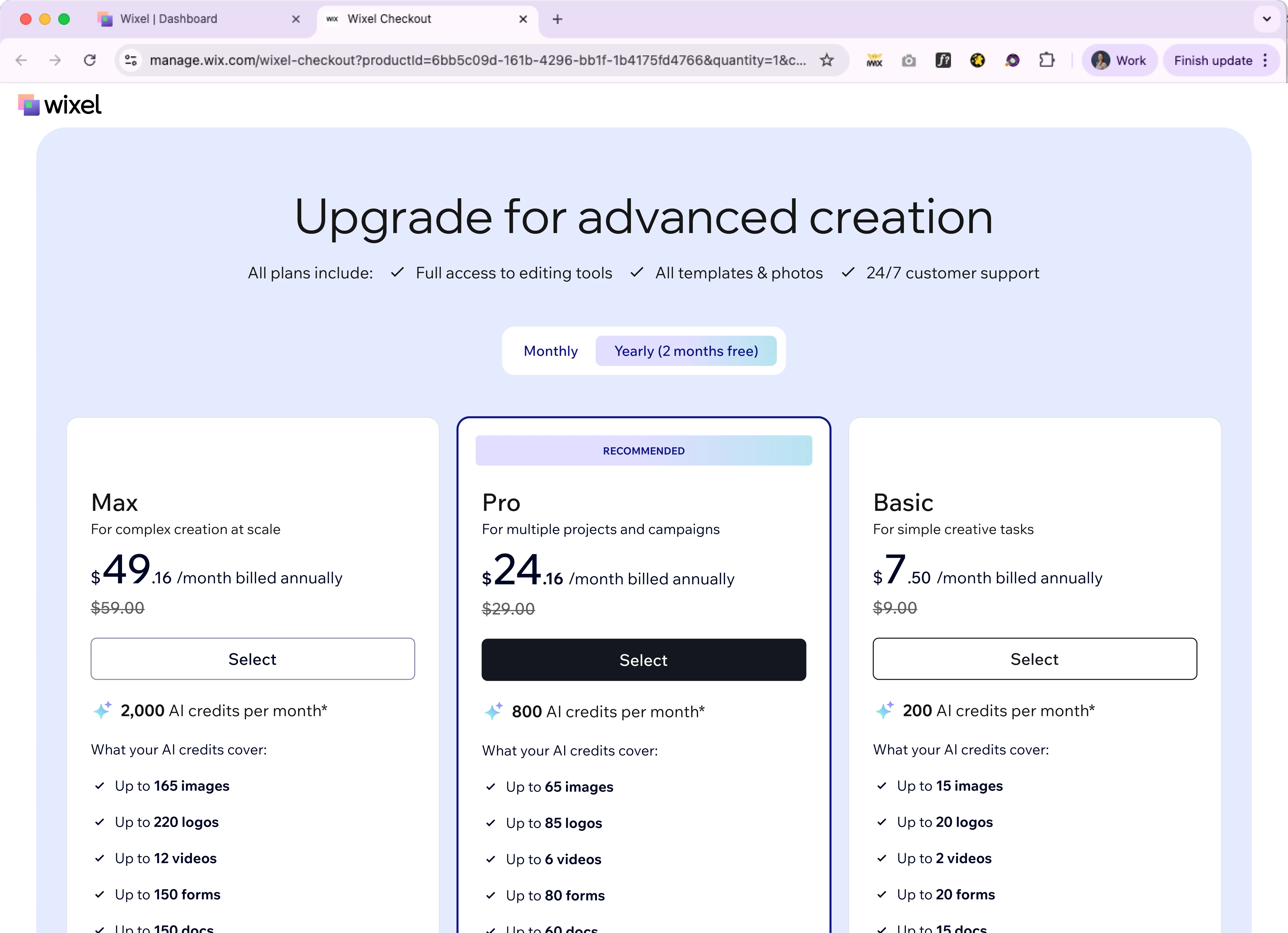
I led the UX design of Wixel's purchase experience across desktop and mobile, creating a pricing model that helped users understand, compare, and purchase AI-powered plans based on credits rather than traditional feature access.
Design Approach
Unlike traditional SaaS products, Wixel plans were differentiated by AI credits rather than feature access. I designed a purchase experience that made this new pricing model easy to understand, compare, and purchase.
As my team led a cross-company initiative to establish a shared AI monetization model across multiple Wix products, I designed the Credits Wallet - a centralized experience where users could track their remaining credits, understand their plan, and purchase more when needed.
I also established UX guidelines for communicating AI credit usage across products, defining when credit consumption should be surfaced and how it should be presented. The goal was to create a consistent experience while allowing individual products to adapt the patterns to their own user journeys.
Mobile version:
After redefining the operational model behind Customer Care, the next challenge was putting it into action. I led the UX design of a next-generation routing engine that automatically matched users with the right available expert based on business rules and real-time operational data.


The Challenge
Customer Care relied on more than 300 product groups. Team Leads manually assigned experts to dozens of groups across different support channels, creating significant operational overhead and making the system difficult to scale.
My goal was to translate complex business rules into a flexible system that operations teams could easily understand, configure, and evolve as business needs changed.
The Solution
As part of a small leadership team, I helped define the operational logic behind the system. We explored multiple approaches-including IVR-inspired decision trees-before converging on an ordered rule engine that balanced flexibility with usability.
Because the engine followed a first-match evaluation model, rule order became a core part of the experience. I designed the interface to make rule priority explicit, enabling operations teams to confidently understand, manage, and reorder routing behavior.
Outcome
The routing engine extended far beyond a single interface. I designed the UX across configuration tools, dashboards, transfer workflows, monitoring experiences, and management interfaces to support the new routing model throughout the platform.
The project established a shared operational foundation for future monitoring, optimization, and rule-based automation. Immediately after launch, direct transfers to the right available expert increased from 15% to 40%, reducing wait times and improving the transfer experience.
Looks like you've stumbled into uncharted territory. Let's get you back on track.
Senior Product Designer & Creator @ Wix (2021–2026)
Wix Premium:
Wix Customer Care:
Product Designer @ BLST (Feb–May 2021)
Spokesperson's Department @ Office of the President of Israel (2018–2021)
TV & Productions Department @ IDF Spokesperson's Unit (2015–2017)
Hi, I'm Tal - a Product Designer based in Tel Aviv.
Over the last five years, I've been designing complex systems and revenue-driving products at scale, combining product strategy, UX expertise, and AI-native workflows.
I enjoy turning complexity into intuitive experiences and using tools like Figma, Claude, and Cursor to accelerate discovery, design, and execution.
When I'm away from the screen, you'll usually find me walking with my corgi, Olly, cycling to a workout, practicing Italian, or making pottery.
Always excited to collaborate with great people, explore new ideas, and challenge conventional thinking.
Let's connect: talvaturi11@gmail.com
The Starting Point
I wanted my portfolio to truly reflect my design approach — something that felt personal, interactive, and purposeful. I started with a website builder, but quickly hit its limitations. The templated constraints didn't match my vision, so I decided to build it from scratch with Claude Code.
AI Workflow
I designed the experience with a macOS-inspired concept in mind — clean, intentional, and focused on showcasing my work. Using Claude Code, I had the flexibility to iterate rapidly without getting locked into any framework or design system. The AI-assisted development workflow let me move from concept to implementation in a way that felt natural and aligned with my design thinking.
Shipping
Once the vision was clear, I moved the project to a Git repository and deployed it with Netlify. This setup gives me the version control and deployment simplicity I need to keep iterating and improving the portfolio as my work evolves.